ING Shop
Overview
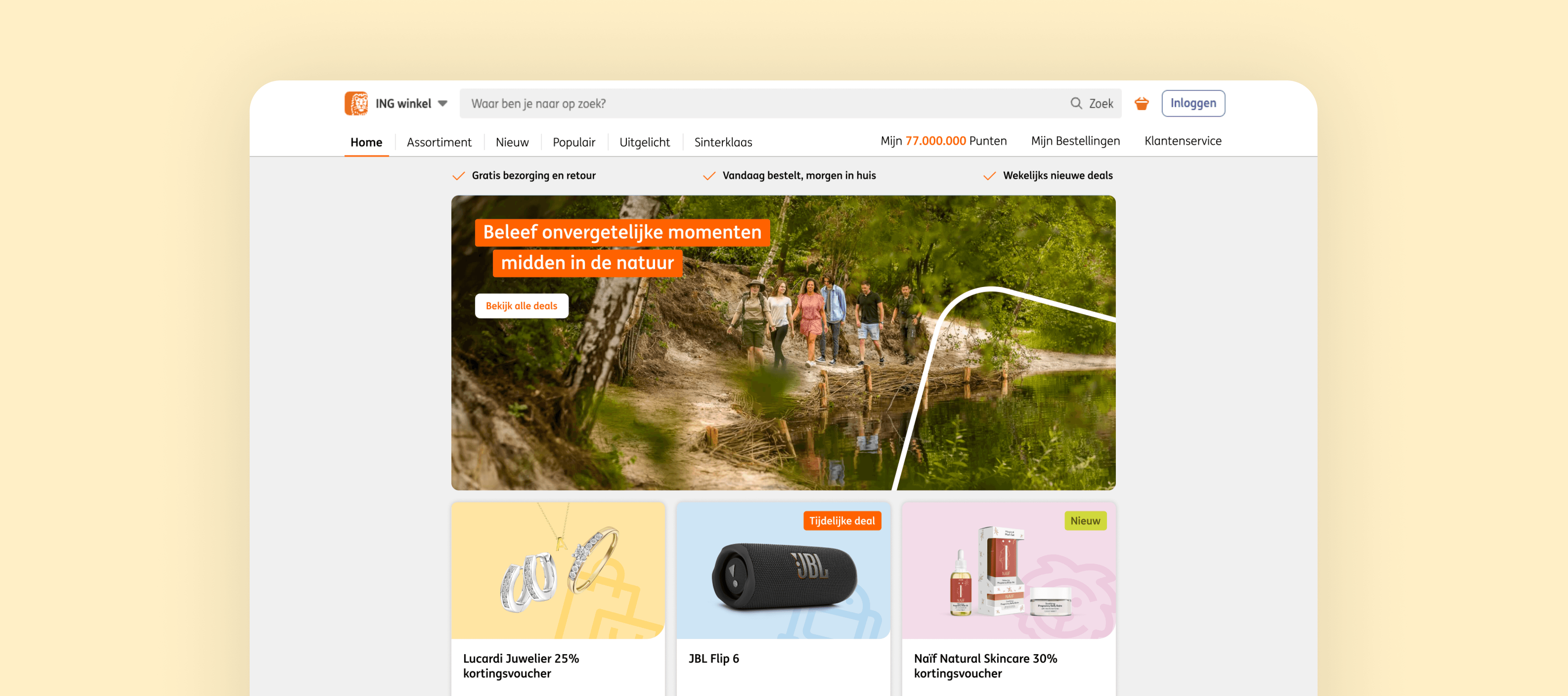
Among the many features ING offers through its digital platforms (app and website) is the ING Winkel (Shop). This feature allows users with a Savings Account to accumulate points through their regular banking activities. These points can then be redeemed for a variety of rewards, including discounts on products, experiences, and outings.
Our objective was to rethink and redesign the ING Shop’s interface to improve user comprehension and navigation, specifically around the various categories where points can be spent. The aim was to deliver a more intuitive and user-centered experience, enabling customers to effortlessly explore and utilize their rewards.
My contribution
Visual Design
Research
Wireframing
Prototyping
The team
1 × product manager
1 × lead designer
2 × visual designers
Year
2024
Process
The Challenges
The ING Shop currently faces several design limitations. The interface feels outdated, with some of the components hard-coded by engineers, leading to a lack of flexibility for updates and improvements in the future.
Additionally, product categories are not easily noticeable. Users are required to scroll through the entire catalog just to get a sense of which discounts are available, resulting in a time-consuming browsing experience.
The Research
Before diving into the design ideation phase, we conducted thorough competitor research to gather inspiration and identify successful design patterns. Our goal was not only to observe what works well but also to understand why these approaches are effective and how we could apply similar strategies to elevate our own user experience.
We focused primarily on well-established Dutch retailers, including Coolblue, Hema, and Etos, analyzing their approach to categorisation, navigation, and user interaction within their digital platforms.
Our research revealed a common pattern across the majority of the shops we analysed: a clear, intuitive categorisation system that effectively distinguishes between products and services. This was a notable gap in the existing ING Shop experience.
Inspired by the use of vibrant colours and distinct shapes to differentiate categories, we saw an opportunity to add more personality into the ING Shop. Given the typically conservative nature of financial platforms, we felt that introducing a playful, visually engaging approach could both enhance usability and create a more inviting user experience.
The client shared our enthusiasm for this direction, and with their approval, we initiated the design phase in Figma, exploring how we could integrate these ideas while maintaining ING’s brand integrity.
The Design Process
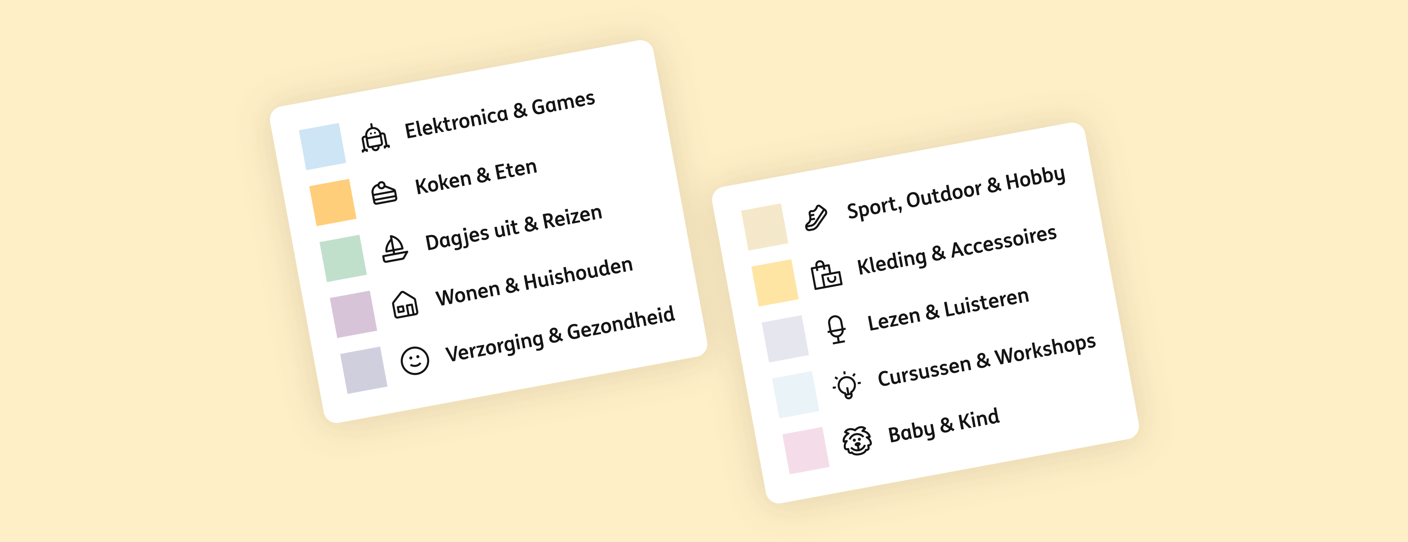
In the initial stages of our design process, we focused on crafting unique yet cohesive shapes and colours to represent each category within the shop. Our goal was to create a system that not only provided visual clarity but also enhanced the overall user experience through distinct, easily recognisable elements.
We aimed for a design language that felt very ING-ish — rounded, fluid, and approachable, in line with the brand’s existing identity. At the same time, it was important for the shape of each product block to be functional, visually appealing, and instantly recognisable within the broader context of the ING ecosystem.
Initially, we explored the idea of creating a cohesive design language through interconnected shapes, aiming to build visual harmony across elements. This concept allowed for fluidity and connection between blocks, reinforcing the sense of unity within the platform.
However, we encountered a significant constraint: having these custom shapes meant that a designer would always be required for updates or adjustments, something the client wanted to avoid due to resource limitations. To address this, we pivoted towards a more scalable solution that could be developed as reusable components, ensuring flexibility and ease of use for the client.

Outcome
Because ING already had some brand assets—colours and icons—we decided to assign a unique colour and icon to each category. This not only aligned with the brand’s visual identity but also provided a functional, reusable system that could be easily implemented and maintained across different use cases.
Given ING’s established Design System, sourcing the icons we needed for each category was seamless. The Design System provided a solid foundation, allowing us to focus on extending its components rather than creating from scratch.
For the colour scheme, we curated the existing ING brand palette, experimenting with various hues and tones to create a distinct identity for each category. This approach ensured that while the categories were visually differentiated, they still felt cohesive and aligned with ING’s overall branding.
The result was a refined and recognisable design for each category, enhancing usability while maintaining brand consistency.