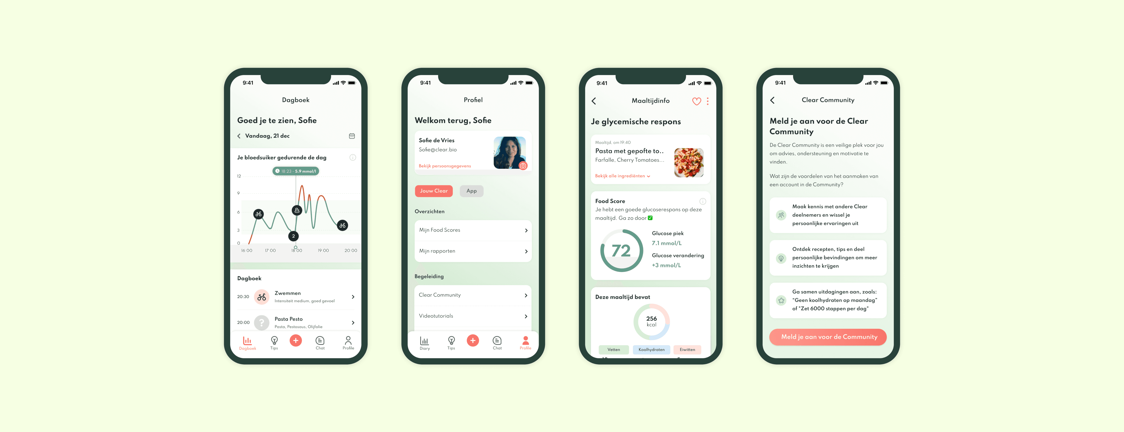
Clear.bio
Overview
Clear is a personal nutrition program based on science and cutting-edge self-monitoring technology. Paired with a Continuous Glucose Monitor (CGM), it serves as an essential self-help tool for individuals managing pre-diabetes or Type 2 diabetes.
Having recently launched in the Netherlands, Clear.bio was in the process of achieving Product/Market Fit. This case study focuses on the first iteration of that effort, where we leveraged user research to deeply understand customer pain points and, in response, initiated a redesign of the mobile app to improve both functionality and user experience.
My contribution
Visual Design
Product Design
Wireframing
Prototyping
The team
1x product manager
1x UI designer
1x user researcher
3x software engineers
Year
2021
Process
The Research
Our research combined qualitative and quantitative approaches, utilising surveys and interviews alongside existing user feedback collected through the app, as well as reviews from the App Store and Google Play.
We conducted interviews and surveys with 20 users who had purchased the program. The primary focus of our research was to gain a deeper understanding of how our target audience perceived the product, the reasons they might discontinue use, and their expectations of the program.
Some of the key questions we used to uncover user pain points included:
"Were your expectations met after joining the program?"
"What do you like and dislike most about the program?"
"How would you describe your experience with the coaching component?"
"In what areas could we improve the program for you?"
These insights were pivotal in informing the redesign of the app, helping us align the product more closely with user needs.
The Pain Points
Having no report / closure after the end of the 14-day program
Delay in the blood glucose graph and Food Scores
Use of two different apps: clear.bio app and the FSL app
No understanding of what to eat or what to avoid
The entire food/activity logging flow
Tackling the pain points
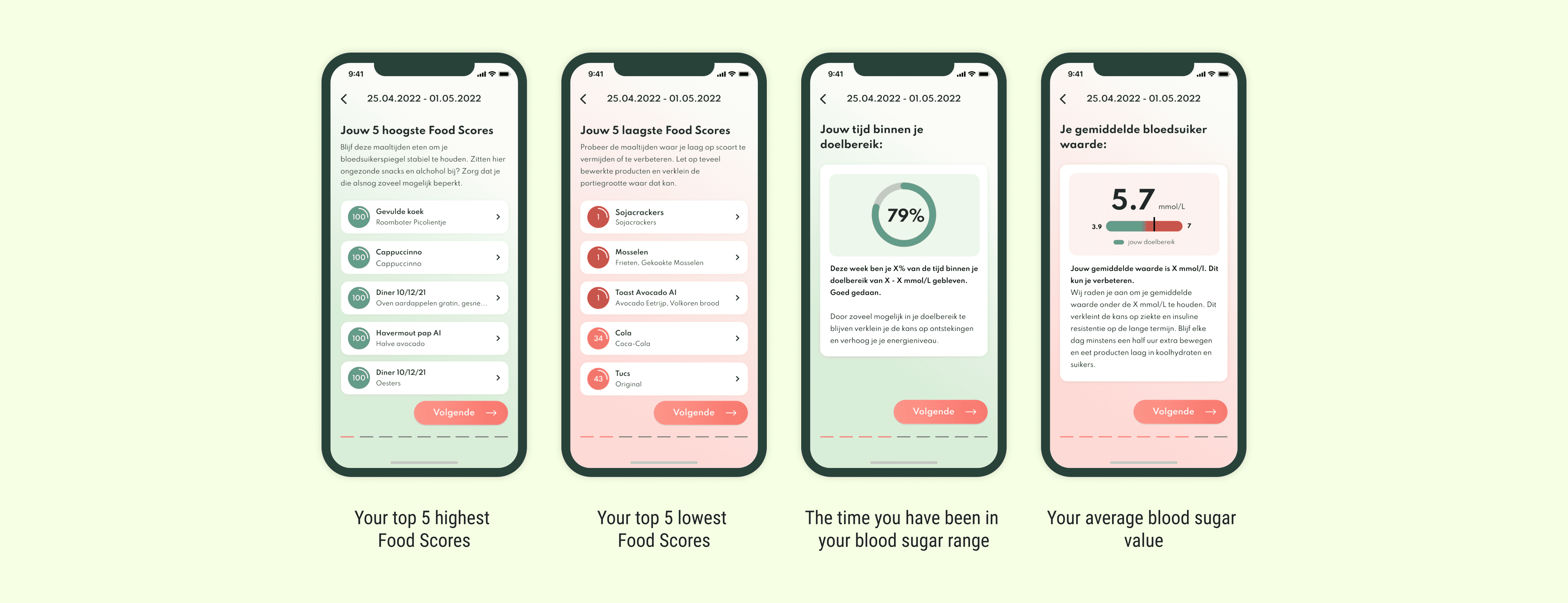
Having no report / closure after the end of the 14-day program
One significant gap in the user experience was the absence of a report or closure at the end of the 14-day program. Participants, who logged their meals throughout the program, expected a summary and actionable insights on their progress, as well as guidance for future lifestyle improvements.
After collaborating with the product manager and user researcher to iterate on our product strategy and design, we decided to implement a report feature that would be delivered to each user at the end of the week. This report would cover key metrics and insights derived from their participation in the program.
We identified essential topics for inclusion in the report, which would provide users with valuable feedback. As a result, at the end of each week (specifically on days 7 and 14), users receive an automated, detailed report based on their data from the preceding week. This report includes: the number of daily blood glucose peaks, their highest and lowest Food Scores, and personalised advice tailored to their lifestyle, aimed at helping them improve their health outcomes.
The feature was initially tested with a group of 10 participants identified as pre-diabetic or diabetic, using a clickable prototype in Figma. Based on their feedback, we made several refinements to enhance the report's clarity and utility.
Additionally, we conducted internal testing, compiling feedback to inform future iterations, which we added to our backlog for version 2 of the feature.
No understanding of what to eat or what to avoid
Another significant challenge identified through user feedback was the lack of clarity regarding what to eat or avoid at the ingredient level to achieve a high Food Score. Many users expressed confusion about how to effectively replace or improve ingredients in their meals.
At the time of this case study, our team was actively developing a feature aimed at addressing this gap. We recognised that, for individuals managing diabetes, the most critical factor in meal choices is the carbohydrate content. Therefore, we designed a feature that offers personalised ingredient-switching advice, enabling users to make healthier meal decisions in the future.
Delay in the blood glucose graph and Food Scores
One of the biggest pain point was the delay in users receiving feedback from their blood glucose graphs and Food Scores. At the time, users had to wait two hours to see data on their glucose levels and up to 24 hours for their first Food Scores. This lack of real-time results significantly hindered their experience.
While this feature was more technical in nature and was released after my departure from the company, I am confident that it had a substantial positive impact on user experience.
The entire food/activity logging flow
We collectively, as a team, acknowledged that the existing food logging process was time-consuming, a sentiment echoed in user feedback. This was a crucial pain point, as many users reported discontinuing their food logging before completing the program. Thus, redesigning the food logging flow became a top priority for us.
While this feature was still in the early stages of development during my tenure, we held a kick-off meeting to scope the project. I also conducted competitor research to identify best practices and essential features that were missing from our current offering.
Outcome
Prior to my role at the company, a branding agency developed new brand guidelines for the product, which needed to be seamlessly integrated throughout the entire app and marketing website.
As the sole designer on this project, I was responsible for translating these guidelines into the user interface. I conducted weekly check-ins with the Product Manager to align on progress and priorities. Additionally, I managed the handover process with the software engineers and the Head of Tech, ensuring that design specifications were clearly communicated and implemented.
Throughout the project, I also conducted periodic testing of the app, providing actionable feedback to the engineering team to address any issues and enhance overall usability.